Choosing the wrong lamination can ruin a fantastic cover design, making it feel cheap or wear out far too quickly. This wastes your budget, damages your brand’s reputation, and leads to disappointed customers. By understanding the core differences between lamination types, you can ensure your product looks and feels exactly as you intended, every single time.
The best lamination depends on your goal. Choose gloss for durability and vibrant colors, making it ideal for educational supplies or children’s notebooks. Select a matte finish for an elegant, modern look that reduces glare, perfect for professional or corporate stationery. For a truly premium product, opt for soft-touch lamination, which provides a luxurious, velvety texture that elevates high-end journals and gift sets.
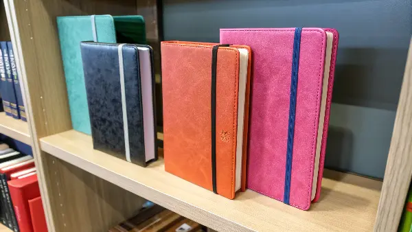
Now you know the basics of the main finishes available for your notebook covers. But the final look and feel of a laminated cover depends just as much on what’s underneath it. The lamination film is only as good as the foundation it’s applied to. So, let’s explore that foundation: the cover material itself. Getting this part right is the critical first step to creating a perfect, long-lasting product.
Does Your Choice of Cover Material Impact Lamination Quality?
You’ve picked a beautiful lamination finish, but the final product looks uneven or starts to peel at the edges. This is incredibly frustrating, causing production delays, quality control headaches, and potential rejections from your customers. The problem often isn’t the lamination film itself, but the paper stock chosen for the cover.
Yes, the cover material is absolutely crucial for a good lamination result. Lamination adheres best to smooth, coated paper stocks of a sufficient weight, typically between 250 and 350 gsm. Using uncoated, highly textured, or very thin paper can cause poor adhesion, which leads to air bubbles, peeling, and a generally unprofessional finish. For a flawless result, the paper and lamination must be perfectly matched.
In my line of work, I’ve seen this issue come up more than once. The success of a lamination job is built on the paper it’s applied to. Let’s break down why this is so important for product managers like Michael, who need consistent quality.
The Importance of Paper Stock Weight (GSM)
Paper weight, measured in Grams per Square Meter (GSM), is the first thing to consider. For a notebook cover, you need something substantial. A stock between 250 gsm and 350 gsm is the ideal range. Anything lighter, and the cover will feel flimsy. More importantly, thin paper tends to curl after lamination, especially with thermal processes that involve heat. The heat and tension can warp a lightweight stock, making the final product look cheap. A heavier cardstock provides the necessary rigidity and stability to withstand the lamination process and create a flat, premium-feeling cover.
Coated vs. Uncoated Stock
This is probably the most critical factor. Coated paper (often called art paper, available as C1S or C2S—Coated One Side or Coated Two Sides) has a thin layer of clay or polymer applied to its surface. This makes the paper incredibly smooth and less porous. This smooth surface is perfect for lamination film, as the adhesive can spread evenly and create a powerful, seamless bond. Uncoated stock, on the other hand, has a more natural, porous texture. The adhesive can sink into the paper fibers unevenly, leading to a weaker bond and potential air pockets or bubbles. I once worked with a client who insisted on an uncoated, raw-feeling cover. We had to run multiple tests with special lamination films to find one that would adhere properly without creating an ugly, mottled effect. For reliability and a clean finish, coated stock is almost always the better choice.
| Material Type | Lamination Suitability | Best For |
|---|---|---|
| Coated Cardstock (250-350 gsm) | Excellent | Most professional notebooks, journals, planners |
| Uncoated Cardstock (250-350 gsm) | Fair (Requires testing) | Rustic or artistic designs; risk of uneven finish |
| Kraft Paper | Poor to Fair | Eco-friendly looks; requires specific cold lamination |
| Lightweight Paper (<200 gsm) | Not Recommended | Prone to curling and feeling cheap |
Gloss, Matte, or Soft-Touch: Which Finish Should You Choose?
The choice between gloss, matte, and soft-touch lamination seems purely aesthetic, but the implications go much deeper. Choosing the wrong finish can misrepresent your product, making a premium journal look cheap or a budget notebook seem out of place. This mismatch can confuse customers and weaken your brand identity. Understanding the practical pros and cons of each finish will help you make a strategic choice that aligns with your product’s purpose and target market.
Choose gloss for maximum durability and vibrant colors, making it ideal for children’s books or high-use academic planners. Select matte for an elegant, non-glare finish that conveys sophistication, perfect for corporate notebooks. Opt for soft-touch lamination to provide a luxurious, velvety feel that elevates high-end journals, gift sets, and premium branded stationery.
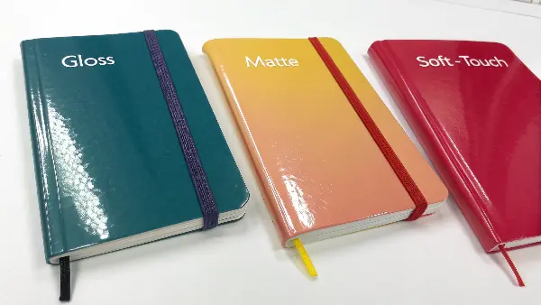
As a supplier, I guide my clients through this decision constantly. The finish is the first thing a customer sees and feels, so it sets their expectation for the entire product. Here’s a deeper look at how each option performs so you can decide what story you want your cover to tell.
When to Use Gloss Lamination
Gloss lamination uses a shiny, reflective film. Its biggest advantage is durability. The hard, smooth surface is resistant to scuffs, dirt, and moisture. You can easily wipe it clean, making it a very practical choice. It also makes colors appear more vibrant and saturated, making graphics and photos "pop."
- Pros: Highly durable, easy to clean, enhances color vibrancy, cost-effective.
- Cons: Can create a glare under direct light, shows fingerprints and smudges easily, can sometimes be perceived as "less premium" than matte.
- Best For: Educational notebooks, children’s activity books, recipe books, catalogs, and any product that will be handled frequently.
The Appeal of Matte Lamination
Matte lamination provides a smooth, non-reflective finish that exudes elegance and sophistication. It gives colors a more subtle, muted look and is soft to the touch. Its major benefit is the lack of glare, which makes text easier to read and gives the design a modern, clean appearance. It also resists fingerprints much better than gloss.
- Pros: Elegant and professional look, no glare, hides fingerprints, feels pleasant to the touch.
- Cons: Can make colors appear less vibrant, more susceptible to scuffs and scratches than gloss.
- Best For: Corporate notebooks, professional planners, art portfolios, minimalist designs, and premium brand stationery.
The Luxury of Soft-Touch Lamination
Also known as velvet lamination, soft-touch is a special type of matte finish that feels incredibly soft and velvety. It offers the same no-glare, sophisticated look as standard matte but with a unique and memorable tactile experience. This finish instantly signals luxury and high quality.
- Pros: Extremely premium feel, unique texture, elegant matte appearance, creates a memorable unboxing experience.
- Cons: The most expensive option, can be more susceptible to marking from oils or lotions on hands, may show scuffs more easily on dark colors.
- Best For: High-end journals, luxury gift sets, premium packaging, and exclusive branded products where you want to make a strong impression.
| Feature | Gloss Lamination | Matte Lamination | Soft-Touch Lamination |
|---|---|---|---|
| Look | Shiny, reflective | Smooth, no-glare | Velvety, no-glare |
| Feel | Smooth, slick | Smooth, natural | Soft, velvety |
| Durability | Very High | Medium | Medium |
| Cost | $ | $$ | $$$ |
| Best For | Vibrancy, Protection | Elegance, Readability | Luxury, Tactile Feel |
Thermal vs. Cold Lamination: What’s the Difference for Book Covers?
When discussing projects with a supplier, you might hear technical terms like "thermal" or "cold" lamination thrown around. As a product manager, you want to know what this means for your notebooks. Not understanding the difference could mean you aren’t getting the most durable or cost-effective solution for your specific project, which can impact both your budget and product quality. Let’s quickly break down what these terms mean.
For book covers, thermal lamination is the industry standard. It uses heat to activate a pre-applied adhesive on the lamination film, melting it onto the paper to create a very strong, permanent bond. Cold lamination uses a pressure-sensitive adhesive, much like a high-quality sticker, and is reserved for heat-sensitive materials. For nearly all standard paper and cardstock notebook covers, thermal lamination offers a better, more durable, and cost-effective result.
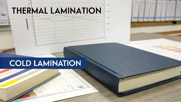
The method of application directly affects the final bond strength and durability of your product. Here at Panoffices, we rely on one method far more than the other for a very simple reason: it delivers better, more reliable results for what our clients need.
How Thermal Lamination Works
Thermal lamination is the backbone of commercial printing. The process involves feeding the printed book cover and a roll of lamination film through heated rollers. The film has a layer of heat-activated glue on one side. When the heated rollers apply pressure, the glue melts and creates an incredibly strong, seamless bond with the paper stock. Once it cools, the bond is permanent.
This method is fast, efficient, and highly cost-effective for large production runs, which is why it’s the preferred choice for most notebook and book manufacturers. It produces a perfectly smooth finish that is highly resistant to peeling. Its only limitation is that the heat can damage certain materials, like covers printed with wax-based inks or some synthetic papers. However, for standard offset or digitally printed cardstock, it’s the perfect solution.
Understanding Cold Lamination
Cold lamination, by contrast, does not use heat. The lamination film used in this process has a very aggressive, pressure-sensitive adhesive on its backing, protected by a release liner. The machine simply applies firm pressure with rollers to bond the film to the substrate. Think of it as applying a giant, perfectly smooth, industrial-strength sticker.
The main advantage of cold lamination is its versatility. Since there’s no heat involved, it can be used on virtually any material, including vinyl, plastics, and prints with heat-sensitive inks. This makes it essential for things like signage and vehicle wraps. However, for book covers, it’s generally overkill. The adhesive bond, while strong, may not be as permanent as a thermal bond over the long term, and the process is typically slower and more expensive. For the vast majority of stationery products, it isn’t necessary.
| Aspect | Thermal Lamination | Cold Lamination |
|---|---|---|
| Method | Heat and pressure to melt adhesive | Pressure only |
| Bond Strength | Excellent, permanent | Very Good |
| Cost | More cost-effective for volume | More expensive |
| Best For | Standard paper & cardstock covers | Heat-sensitive inks or materials (e.g., vinyl) |
| Our Recommendation | The standard for notebooks | Used only for special cases |
How Do Design File Formats Impact Your Final Laminated Cover?
Your design looks absolutely perfect on your computer screen, but the final printed and laminated cover has blurry text or the colors look slightly off. This is a product manager’s nightmare. It can lead to expensive reprints, missed deadlines, and a final product that doesn’t meet quality standards. In almost every case, these issues start with the design file itself. Getting the file format and setup right is the foundation of a quality print job.
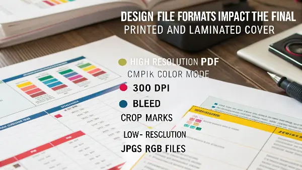
The best format is a high-resolution, print-ready PDF. Your file must be set to the CMYK color mode, have a resolution of at least 300 DPI, and include bleed and crop marks. Using the wrong format, like a low-resolution JPG or an RGB file from a website, will almost certainly result in blurry images, pixelation, and inaccurate colors. The lamination on top will only highlight these flaws.
I often speak with clients like Michael who have a strong design vision. My job is to make sure that vision translates perfectly into a physical product. This starts with a technical check of the artwork files. A great lamination finish can’t fix a poor print, and a great print starts with a great file.
Why a Print-Ready PDF is King
A properly saved PDF is the universal standard for professional printing. Unlike a JPG or PNG, a PDF can contain a mix of vector graphics (logos, text) and raster images (photos). Vector elements can be scaled to any size without losing quality, ensuring your text and logos are always sharp. A PDF also embeds all the necessary fonts and image information into a single, self-contained file. This means the printer sees exactly what you see, with no surprise font substitutions or missing images. It’s a locked-down, reliable container for your design.
Key Technical Specifications for Your File
To avoid common printing problems, your designer must follow a simple checklist. The lamination process happens after printing, so any print errors will be sealed under that protective layer forever.
- Resolution: All images in your file should be at least 300 Dots Per Inch (DPI). Anything lower (like the 72 DPI standard for web images) will look pixelated and blurry when printed.
- Color Mode: Your file must be set up in CMYK (Cyan, Magenta, Yellow, Black), the four-color process used in printing. Files in RGB (Red, Green, Blue), the mode used for screens, will undergo a color shift when converted for print, often resulting in dull or unexpected colors.
- Bleed: This is extra image area that extends beyond the final trim edge of your cover, usually by 3-5mm on all sides. When the laminated sheet is cut to size, the bleed ensures the color and image go right to the very edge, with no accidental white slivers showing.
- Safe Zone: All critical elements like logos and text should be kept inside a "safe zone," typically 5mm or more inside the trim line. This prevents them from being accidentally trimmed off during the final cutting process.
| Technical Spec | Requirement | Why It’s Important for Lamination |
|---|---|---|
| File Format | Print-Ready PDF | Locks in fonts and images for reliable output. |
| Resolution | 300 DPI | Ensures photos and graphics are sharp under the laminate. |
| Color Mode | CMYK | Guarantees colors print accurately as you designed them. |
| Bleed | 3-5mm | Allows lamination and color to extend fully to the cover’s edge. |
Conclusion
Choosing the right lamination isn’t just about picking a finish. It’s a strategic decision that involves matching the finish to the right paper stock, your brand’s identity, and your product’s intended use. By getting the technical details right from the start, you ensure the final product is durable, beautiful, and perfectly represents your vision.

