Choosing endpapers seems like a small detail, but getting it wrong can ruin the feel and durability of a premium notebook. The wrong paper can tear, colors can clash, or it might just feel cheap, undermining your brand’s quality perception. Understanding the materials, designs, and technical specifications is the key to making a perfect choice every time.
Choosing the perfect endpapers involves three key steps. First, select a durable material like offset or specialty paper that complements the book’s purpose. Second, align the design—whether a solid color, pattern, or custom print—with your brand’s aesthetic. Finally, ensure the technical specifications, such as paper weight (GSM) and grain direction, support the book’s structure and longevity. This ensures a premium, lasting product.

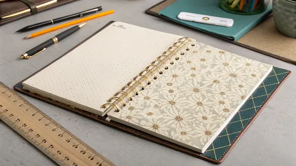
Those little details often make the biggest difference in product development. As a manufacturer, I’ve seen countless projects where the endpapers transformed a standard notebook into something truly special. They are more than just decorative sheets; they are a critical structural component that joins the book block to its cover. Getting them right is a hallmark of quality. So, let’s break down exactly what you need to consider to master this crucial element, starting with the very foundation: the material itself.
What Materials Are Best for Book Endpapers?
You want your notebook to feel premium from the moment someone opens it, but the variety of paper options can be overwhelming. Choosing a paper that’s too thin might tear under stress, while one that’s too thick can make the cover stiff and difficult to open. It is a frustrating balancing act that can impact the user experience.
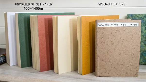
The best materials for book endpapers are typically uncoated offset paper (100-140gsm) for its versatility and printability, or specialty papers for a unique texture and premium feel. For high-end projects, consider colored paper stock or even kraft paper. The key is choosing a material that is slightly heavier than the inner pages but flexible enough to function as a hinge, preventing stress on the book block.

The endpaper, also known as the endsheet, serves a dual purpose. Structurally, it is the bridge that connects the book’s pages (the book block) to the cover. A single folded sheet is tipped onto the first and last pages of the book block, with the outer leaf (the pastedown) glued to the inside of the cover board. This hinge action takes a lot of stress, so the material must be durable. Aesthetically, it’s the first thing your customer sees when they open the product, setting the tone for the entire experience. I always advise my clients to think of the endpaper as the opening credits to their brand’s story.
Common Material Choices
The material you choose sends a direct message about your product’s quality.
- Uncoated Offset Paper: This is the industry standard for a reason. It’s strong, cost-effective, and provides an excellent surface for printing custom designs or solid colors. A weight between 100gsm and 140gsm is the sweet spot for most notebooks and planners, offering durability without adding too much bulk.
- Specialty Papers: This category includes materials with unique textures and finishes, like laid, felt, or linen paper. They add a tactile, luxurious feel that instantly elevates a product. Kraft paper is another excellent choice, especially for brands with an eco-conscious or rustic aesthetic. It’s incredibly durable and has a wonderful natural look.
- Colored Paper Stock: Instead of printing a solid color, using a paper that is dyed at the pulp stage provides a deep, consistent color that won’t show white if scuffed. It’s a fantastic option for creating a bold, premium look that coordinates with your cover design or branding.
Matching Material to Product Type
The end-use of the product should heavily influence your material choice. An executive planner requires a different approach than a child’s drawing book. I recently worked with a client launching a line of sustainable journals. We chose a 120gsm recycled kraft paper for the endpapers. It not only supported their brand story but also provided a durable, tactile feel that perfectly communicated quality and sustainability.
| Product Type | Recommended Endpaper Material | Why It Works |
|---|---|---|
| Corporate Notebook | 120gsm Uncoated Offset or Colored Stock | Professional look, durable for daily use, and ideal for printing logos. |
| Executive Planner | 140gsm Specialty Paper (e.g., Linen Finish) | Adds a luxurious, tactile feel that communicates high value and sophistication. |
| Creative Journal | 120gsm Kraft or Recycled Paper | Offers a unique, rustic aesthetic and is robust enough for artistic use. |
| School Exercise Book | 100gsm Uncoated Offset Paper | Cost-effective for high volumes, yet durable enough to withstand a school year. |
How Can Endpaper Design Elevate Your Brand?
A blank white or cream endpaper is perfectly functional, but it feels like a missed opportunity to make a statement. However, custom designs can feel risky. What if the colors don’t match the cover perfectly? What if a busy pattern distracts from the notebook’s clean aesthetic? These are valid concerns that can make anyone hesitant to invest in customization.
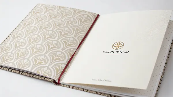
Endpaper design elevates your brand by creating a powerful first impression. A custom pattern or a bold, solid color reinforces your brand identity the moment the book is opened. You can use it to tell a story, display a subtle logo, or add a touch of luxury that sets your product apart. It’s a key detail that transforms a functional item into a curated experience, significantly boosting perceived value.

Think of the endpaper as prime real estate for branding. It’s a canvas that can immediately communicate your brand’s personality—be it professional, playful, minimalist, or artistic. A thoughtful design shows your customer that you’ve considered every detail of their experience. I worked with a German product manager, Michael, who was developing a new line of high-end planners. He wanted a minimalist yet undeniably premium feel. We chose a solid, deep navy endpaper using a specific Pantone color to perfectly match his company’s logo. To add a final touch of class, we added the brand mark as a blind deboss in the bottom corner. It was subtle, sophisticated, and spoke volumes about their brand’s commitment to quality.
Popular Design Approaches
There are several effective ways to use this space, each serving a different strategic purpose.
- Solid Color: The simplest and often most elegant choice. Using one of your primary brand colors creates a clean, cohesive look. It’s a powerful way to reinforce brand identity without needing complex graphics.
- Step-and-Repeat Pattern: A pattern made from your logo or a brand icon is a classic way to fill the space. It adds visual interest while keeping the branding consistent and central. The key is to keep it subtle, so it doesn’t overpower the page.
- Custom Illustration or Map: This is perfect for themed products. A travel journal could feature a world map, a city guide might have a stylized street map, and a nature journal could have botanical illustrations. This design adds genuine value and storytelling to the product.
- Informational Content: For planners and professional notebooks, the endpaper is a great place for useful information. This could be a perpetual calendar, a world time zone map, or a table of measurement conversions. It makes the product more functional and indispensable to the user.
Design Considerations for Production
To ensure your design translates perfectly from the screen to the printed page, you must discuss a few key details with your manufacturer.
| Design Element | Key Consideration | Pro Tip |
|---|---|---|
| Color Matching | Will you use Pantone (PMS) or CMYK? | For precise brand color matching, always specify a Pantone color. CMYK is great for full-color images but can have slight variations. |
| Bleed and Trim | The design must extend beyond the final trim line. | Always provide your artwork with at least 3-5mm of bleed on all sides to avoid any unsightly white edges after trimming. |
| Pattern Alignment | How will the pattern look when folded and glued? | Test your pattern to ensure it doesn’t have an awkward break along the hinge or near the edges. An asymmetrical or seamless pattern is often safest. |
| Ink Coverage | Will heavy ink coverage cause issues? | On uncoated paper, heavy ink saturation can sometimes cause the sheet to warp or crack at the fold. Discuss this with your supplier; a different paper or a protective varnish might be needed. |
What Technical Specifications for Endpapers Should You Never Overlook?
You’ve chosen a beautiful material and created a stunning design. The job is almost done, right? Not quite. This is where technical mistakes can derail a project. An endpaper with the wrong grain direction can cause the entire cover to warp, while incorrect sizing leads to assembly problems and costly waste. These are the kinds of issues that cause major production delays and frustration.
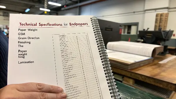
Never overlook three key technical specifications for endpapers: paper weight (GSM), grain direction, and finishing. The weight should be heavier than the text block but not so heavy it strains the hinge. The grain direction must run parallel to the spine to prevent warping. Finally, consider finishes like lamination for durability and aesthetic effect, especially if the endpaper is heavily printed.

Getting the technical details right is what separates a professional, durable product from one that fails over time. These specifications aren’t just arbitrary numbers; they directly impact the structural integrity and longevity of the book. As a supplier, this is where our expertise becomes critical. I remember a project where a client’s initial spec sheet had the grain direction listed incorrectly for the endpapers. My team and I caught it during our pre-production review. It was a simple correction on paper, but if it had gone to print, it would have resulted in thousands of notebooks with covers that wouldn’t lay flat. We always double-check these details, because that’s what partnership is about.
The Critical Trio: GSM, Grain, and Finishing
If you only focus on three technical specs, make it these three.
- GSM (Grams per Square Meter): This measures the paper’s weight and density. For endpapers, you need a sheet that’s substantial enough to withstand the stress of opening and closing. A good rule of thumb is to choose a weight that is 1.5x to 2x the weight of your inner pages. For typical 80gsm inner pages, a 120gsm or 140gsm endpaper is an excellent choice.
- Grain Direction: This is arguably the most critical technical detail. Paper fibers align in a specific direction during manufacturing. For endpapers, the grain MUST run parallel to the spine of the book (this is called "grain long"). This allows the paper to fold cleanly and flex with the hinge. If the grain runs perpendicular ("grain short"), the paper will resist bending, causing the cover to warp and not close properly.
- Finishing: A finish can protect the endpaper and enhance its design. This is especially important for endpapers with heavy ink coverage, which can be prone to scuffing. A matte or gloss lamination adds a protective layer and can alter the feel, while a varnish can do the same with less thickness.
Special Processes for a Premium Touch
Beyond the basics, special finishing processes can add another layer of customization and perceived value. These are best used to highlight specific design elements.
| Process | Description | Best For |
|---|---|---|
| Laminating (Matte/Gloss) | A thin plastic film is applied to the paper surface. | Protecting heavily printed endpapers, adding a smooth or non-reflective texture, and increasing durability. |
| Foil Stamping | A metallic or pigmented foil is applied with heat and pressure. | Adding a touch of luxury with a metallic logo, brand name, or small design element. |
| Debossing / Embossing | Creating a recessed (debossed) or raised (embossed) impression in the paper. | Adding subtle, tactile branding. A blind deboss (no ink or foil) is a very sophisticated, minimalist effect. |
| Spot UV Varnish | A high-gloss varnish is applied to specific parts of the design. | Making certain elements, like a logo or pattern, pop with a shiny, wet look against a matte background. |
Conclusion
Choosing the right endpaper is a blend of art and science. By carefully considering the material, creating a design that reflects your brand, and confirming the critical technical specifications, you do more than just complete a notebook. You create a cohesive, memorable, and durable product that delights your customers from the very first page. These details signal quality and care.

