Are your religious materials failing to make a lasting impression? Many organizations find their scripture cards, study guides, and publications look generic and feel disposable, struggling to convey the profound importance of the message they carry. This disconnect can leave your community feeling uninspired and the materials quickly forgotten. True connection begins with presentation that reflects care and quality.
Specialty religious publication printing elevates materials by combining high-quality paper stocks, thoughtful custom design, and durable finishing options. By carefully selecting materials that feel substantial, creating artwork that resonates with your community, and using techniques like foil stamping or embossing, you transform simple paper into cherished keepsakes. This enhances the perceived value of the message and encourages deeper, more meaningful engagement with the content.
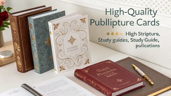
I’ve worked with many organizations on their printing projects over the years. A common theme I see is the desire to create something that feels special, something that people want to hold onto. It’s not just about printing words on paper; it’s about creating an experience that honors the content. The difference between a standard handout and a specialty publication is in the details.
Let’s explore what those details are and how they can profoundly change the way your community interacts with your materials. We’ll break down the key decisions you’ll face, from choosing the right paper to finding a partner who understands your vision.
What Materials Best Suit Different Religious Publications?
Have you ever been handed a scripture card that felt flimsy and cheap? It’s a small detail, but it can subtly undermine the weight of the message it carries. When the material doesn’t match the mission, the item can feel transient and unimportant. This is why selecting the right paper and finish is one of the most critical first steps.
The best materials are chosen based on the item’s function. Scripture cards and prayer cards thrive on thick, durable cardstock (300-400 gsm) with a matte or soft-touch lamination for a premium feel. For study workbooks and journals, an uncoated, writable paper (100-120 gsm) is essential for taking notes. Meanwhile, booklet covers benefit from a heavier, coated stock for vibrant color and protection, while the inner pages remain lighter and easy to read.
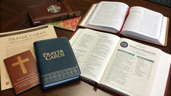
Choosing the right material is a blend of art and science. It’s about how the paper feels in your hand, how it takes ink, and how it holds up over time. As a product developer, I always start by asking, "How will this be used?" A card meant for a wallet needs to be tougher than a page in a weekly bulletin. A study guide needs to lay flat and welcome pen or pencil marks without smudging.
Let’s break down some common choices to help you decide.
Understanding Paper Stock and Finishes
The weight, texture, and finish of your paper all contribute to the final product’s look and feel. Heavier paper, measured in grams per square meter (gsm), communicates quality and durability. The finish affects both aesthetics and functionality.
| Material Type | Common Weight (gsm) | Best For | Key Characteristics |
|---|---|---|---|
| Coated Cardstock | 300-400 gsm | Scripture Cards, Postcards, Booklet Covers | Smooth surface, available in gloss or matte. Makes colors pop. Durable and rigid. |
| Uncoated Paper | 100-140 gsm | Study Guides, Workbooks, Note Pads, Journals | Natural, textured feel. Excellent for writing on without smearing. Great readability. |
| Textured Paper | 120-300 gsm | Invitations, Certificates, Special Covers | Offers a tactile experience (e.g., linen, felt). Adds a touch of elegance and tradition. |
| Recycled Paper | 90-300 gsm | Bulletins, Handouts, Eco-conscious Projects | Shows a commitment to sustainability. Modern feel with slight, natural imperfections. |
The Role of Lamination
After printing, a thin protective layer called lamination can be applied. This is especially useful for items that will be handled frequently.
- Gloss Lamination: Creates a shiny, reflective finish that makes images and colors very vibrant. It’s great for covers but can be hard to write on.
- Matte Lamination: Provides a smooth, non-reflective, and elegant finish. It feels sophisticated and resists fingerprints well.
- Soft-Touch Lamination: This is my personal favorite for premium items. It has a matte look but a unique, velvety texture that people love to touch. It instantly elevates a simple card into something special.
How Can Custom Design Enhance the Impact of Scripture Cards and Study Guides?
Does your organization’s material look like it could have come from anywhere? Using generic templates and stock imagery can create a disconnect, failing to reflect your community’s unique spirit. These materials often lack a personal touch, making it harder for your message to resonate on a deeper, more emotional level. True engagement comes from design that speaks directly to your people.
Custom design enhances impact by creating a cohesive and recognizable visual identity that reinforces your message. By using specific typography that is clear and reverent, a deliberate color palette that evokes the right emotions, and thoughtful layouts that guide the reader’s eye, you make the content more accessible and memorable. This intentional approach transforms a simple guide or card into a powerful tool for connection and reflection, making it uniquely yours.
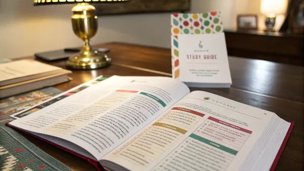
I remember working with a client who wanted to create a welcome packet for new church members. Initially, they just used standard Word templates. The information was there, but it felt cold and corporate. We worked together to develop a custom design that incorporated the church’s logo colors, a warm and inviting font, and subtle graphic elements inspired by their sanctuary’s architecture. The final product felt like a personal welcome, a true reflection of the community’s heart. That’s the power of custom design. It tells a story before a single word is read.
Key Elements of Effective Design
A professional designer will focus on several key areas to ensure your publications are not only beautiful but also highly effective.
1. Typography
The fonts you choose set the tone. For religious texts, clarity is paramount.
- Body Text: A classic, readable serif font like Garamond or Caslon is often used for its traditional and authoritative feel. For a more modern approach, a clean sans-serif like Lato or Open Sans can work well, especially for materials aimed at younger audiences.
- Headings & Accents: A complementary script or display font can be used sparingly for titles or key verses to add elegance and visual interest. The key is to ensure it remains legible.
2. Color Palette
Colors evoke emotion. A well-chosen palette can create a sense of peace, reverence, celebration, or solemnity. It’s important to select colors that align with your organization’s identity and the theme of the publication. For example, earthy tones might be used for a study guide on creation, while blues and whites can create a sense of tranquility for materials on peace and reflection.
3. Layout and White Space
How content is arranged on the page is crucial. A cluttered layout is overwhelming and difficult to read. Good design uses ample white space (the empty areas on the page) to give the text and images room to breathe. This creates a calm, focused reading experience and helps guide the reader’s attention to the most important elements. For study guides, this means leaving enough room in the margins for notes.
What Functional Features Make Religious Study Materials More Engaging?
Have you ever tried to use a study guide that refuses to stay open or a journal with no space for your thoughts? It’s frustrating when a tool designed to help you connect and reflect actively gets in the way. Materials that aren’t user-friendly can discourage participation and turn a spiritual exercise into a struggle with paper and binding.
Functional features like spiral binding that allows a book to lay flat, perforated pages for easy removal, and dedicated sections for notes and reflections are what make study materials truly engaging. Adding tabs for quick navigation through different sections or including a pocket for loose papers can also dramatically improve the user experience. These practical details transform a static book into an interactive and personal spiritual tool.
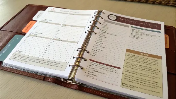
One of the smartest requests I ever received from a client was for a "lay-flat" prayer journal. They explained that users often had their hands full during group prayer and couldn’t hold the book open. We switched from a standard perfect binding to a wire-o binding. This simple, functional change revolutionized how their community used the journals. They saw engagement skyrocket because the material was finally designed for how people actually lived and worshipped. Functionality isn’t a boring detail; it’s a form of ministry, showing you care about the user’s experience.
Practical Enhancements for Better Engagement
Thinking about how the end-user will interact with your material is key. Here are some functional features that can make a huge difference.
1. Binding Options
The way your booklet or journal is held together affects its usability.
- Saddle Stitch: Best for smaller booklets (under 64 pages). Two staples in the middle. Cost-effective but doesn’t lay completely flat.
- Perfect Binding: The classic "paperback book" spine. Looks professional but can be stiff and hard to keep open.
- Spiral or Wire-O Binding: The pages rotate 360 degrees, allowing the book to lay perfectly flat. This is the gold standard for workbooks, planners, and journals where writing is the primary activity.
2. Interactive Elements
Incorporate features that invite the user to do more than just read.
- Wide Margins & Lined Sections: Explicitly design space for note-taking. This signals to the user that their thoughts and reflections are part of the process.
- Perforated Pages: Allow users to tear out memory verses, prayer requests, or activity sheets to post on a mirror or share with others.
- Tip-in Pockets: A simple pocket glued inside the front or back cover provides a convenient place to hold loose notes, cards, or handouts.
3. Navigational Aids
For longer study guides or texts, help users find their way around.
- Die-Cut Tabs: Add tabs along the edge of the page to separate months, chapters, or topics. This makes finding a specific section quick and easy.
- Ribbon Bookmarks: Binding a ribbon directly into the spine adds a touch of class and is incredibly useful for marking one’s place in a journal or devotional.
What Should You Look For in a Printing Partner for Religious Materials?
Have you ever felt misunderstood by a supplier who just saw your project as another print job? They might focus on speed and cost, a "one-size-fits-all" approach. This can lead to mistakes, missed details, and a final product that lacks the reverence and care your content deserves. Without a partner who understands the unique nature of religious publications, the process can be stressful and the outcome disappointing.
You should look for a printing partner who offers collaborative expertise, not just a service. This means finding a supplier with experience in specialty printing who asks questions about your project’s purpose and audience. They should provide physical samples, offer clear communication throughout the process, and demonstrate a commitment to quality control. A true partner acts as an advisor, helping you choose the right materials and finishes to honor your message effectively.
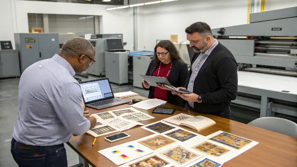
Over the years, I’ve learned that the best partnerships are built on communication and trust. I once worked with a ministry creating Bibles for a youth camp. They were on a tight budget but wanted something that felt special. Instead of just giving them the cheapest option, we talked about their goals. We ended up using a simple, durable cover but added a custom-printed ribbon bookmark in the camp’s colors. It was a small, affordable detail that made each Bible feel like a personal gift. That’s what a good partner does: they listen to your "why" and then help you figure out the "how."
Checklist for Selecting the Right Supplier
Finding the right manufacturer isn’t just about comparing price quotes. It’s about finding a team that will invest in your project’s success. Here’s what to look for.
Communication and Expertise
- Do they ask insightful questions? A good partner wants to understand your vision, your audience, and how the item will be used. They should be able to provide suggestions, not just take orders.
- Are they responsive and clear? Look for a supplier who communicates clearly and regularly. If you’re working with an overseas partner like us at Panoffices, this is especially crucial. Language should not be a barrier to getting your project right.
- Can they provide samples? You should always be able to see and feel the materials before committing to a full production run. A reliable supplier will happily provide paper swatches, print proofs, and examples of past work.
Technical Capabilities and Quality Control
- Do they offer the services you need? Ensure they have the equipment and skills for specialty finishes like foil stamping, embossing, or die-cutting if you need them.
- What is their quality control process? Ask how they ensure color consistency, correct binding, and flawless finishing from the first copy to the last. A good partner will have a rigorous inspection process at multiple stages of production. We believe in getting it right every time.
Partnership and Reliability
- Do they have experience in your niche? While not always necessary, a supplier with experience producing religious or inspirational materials will better understand the level of care and respect required.
- Can they meet your timeline? Be upfront about your deadlines. A trustworthy partner will give you a realistic production and shipping schedule and keep you updated along the way.
Conclusion
Creating specialty religious publications is about more than ink on paper. It’s an opportunity to create a meaningful connection with your community. By carefully choosing materials, investing in thoughtful design, incorporating user-friendly features, and selecting the right printing partner, you can produce materials that not only inform but also inspire, becoming cherished tools for faith and reflection.

