Struggling to make your religious publications stand out? A plain cover can fail to convey the sacredness of the text inside, making it feel less special and less likely to be cherished. This lack of a premium finish can impact its appeal as a meaningful gift or a treasured family heirloom.
Foil stamping elevates religious publications by adding a tactile and visual element of luxury and reverence. It’s primarily used on covers, spines, and page edges to highlight titles, sacred symbols, and intricate decorative patterns. This technique transforms a simple book into a cherished keepsake, enhancing its perceived value and making it an ideal gift. Choosing the right foil, design, and material ensures the final product feels both sacred and timeless.
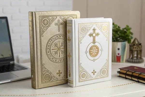
The feel of a beautifully crafted book is powerful, especially when it holds sacred texts. That touch of gold or silver foil can transform an ordinary object into something that feels truly special and divinely inspired. But achieving that perfect, reverent finish isn’t just about adding a bit of shine. It requires careful thought about where and how to apply it. As a manufacturer, I’ve guided many clients like you through this process. Let’s explore the key considerations together to ensure your publications are treated with the respect they deserve.
Which Foil Stamping Applications Best Suit Religious Texts?
You know foil stamping can add elegance, but you’re not sure where to apply it for the best effect on religious books. Applying it incorrectly can lead to a design that looks unbalanced or gaudy, failing to capture the intended tone of reverence. Focusing on traditional placements ensures a classic, respectful, and impactful design.
The most effective applications for religious texts are on the cover, spine, and page edges. On the cover, foil is perfect for the main title (e.g., "Holy Bible," "Quran") and central religious symbols. On the spine, it ensures the title is visible and adds a touch of class when on a bookshelf. Gilded page edges, or "gilt-edging," provide the ultimate premium finish, making the book shine from every angle and protecting the paper over time.
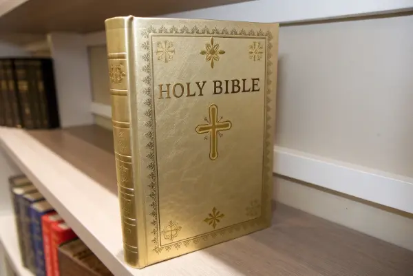
When we talk about applying foil, we’re really talking about creating focal points that draw the eye and communicate importance. The goal isn’t just decoration; it’s to enhance the user’s connection to the text. I’ve found that a "less is more" approach often works best, using foil to highlight the most significant elements of the publication. Let’s break down the most impactful areas.
The Holy Trinity of Foil Placement
Each application serves a distinct purpose, and combining them creates a truly cohesive and premium product.
-
The Cover: The First Impression
The cover is where the reader first connects with the book. Foil stamping is essential here for two key elements: the title and the central symbol. A foil-stamped title like "Holy Bible" in a classic serif font immediately sets a reverent tone. Pairing this with a beautifully rendered cross, Star of David, or Islamic crescent in matching foil creates a powerful visual identity. We often recommend this for hardcover editions, especially those intended as gifts for baptisms, weddings, or other religious milestones. -
The Spine: The Shelf Appeal
A book spends most of its life on a shelf. The spine is its public face. Foil stamping the title and perhaps a small, simple symbol on the spine ensures it remains distinguished. I remember a project for a series of theological texts where we used a consistent spine design across all volumes. The unified look of the gold foil on dark blue leather created a stunning library set that spoke of authority and wisdom. It’s a detail that adds immense value for collectors and scholars. -
Page Edges: The Ultimate Luxury
Gilt-edging, or applying foil to the three outer edges of the book’s pages, is the hallmark of a high-end religious text. This isn’t just for looks; it helps protect the paper from moisture and dust, preserving the book for longer. The subtle shimmer when the book is closed gives it an almost ethereal quality. While gold is traditional, I’ve seen beautiful results with silver and even rose gold for more modern interpretations of prayer journals or devotional books.
What Foil Colors and Finishes Work Best for Religious Themes?
Choosing the right foil color can be difficult. You want something that feels appropriate and respectful, but also visually appealing. A color that’s too bold might seem irreverent, while a finish that’s too plain can get lost on the cover material. The key is to match the foil to the tone and tradition of the publication.
For traditional religious publications like Bibles or the Quran, classic metallic gold and silver are the safest and most popular choices. Gold foil conveys divinity, wisdom, and timelessness, while silver offers a feeling of purity and modern elegance. For contemporary devotionals or religious journals, you can explore subtle variations like rose gold, antique gold, or even matte white foil for a minimalist, sophisticated look on dark-colored covers.
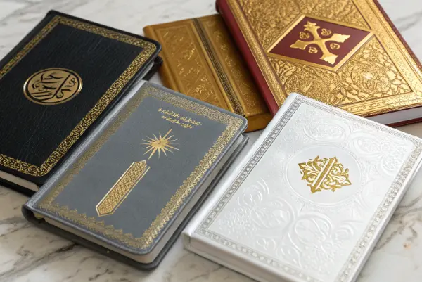
The color of the foil does more than just add shine; it sets the entire mood for the publication. I always advise my clients to think about the message they want to send. Is it one of ancient tradition, or of modern spirituality? Is it for a solemn text or an inspirational journal? The answer will guide your choice. We can’t just pick a color we like; we have to pick the color that feels right for the content.
A Spectrum of Reverence: Matching Foil to Message
Let’s look at the options and where they fit best. The choice of finish—whether metallic, matte, or holographic—adds another layer of meaning.
-
Metallic Gold: This is the undisputed classic. It symbolizes divinity, enlightenment, and enduring value. For centuries, gold has been used in sacred art and texts. When a customer wants to create a definitive, heirloom-quality Bible or Torah, I almost always recommend a bright metallic gold. It pairs beautifully with traditional black, burgundy, or navy leather covers.
-
Metallic Silver: Silver is the second most popular choice. It’s often associated with purity, truth, and clarity. It offers a cooler, more contemporary feel than gold while still being classic and respectful. I find it works exceptionally well on white, gray, or cool blue covers. It’s a great option for wedding Bibles or publications aimed at a younger, modern audience.
-
Beyond the Classics: For less traditional publications like prayer journals, women’s devotionals, or spiritual wellness guides, we have more creative freedom.
- Rose Gold: This color has become very popular. It feels feminine, warm, and gentle. I worked with a client on a mother-daughter devotional journal, and the rose gold foil on a soft pink cover was a perfect match.
- Copper/Antique Gold: These foils offer a rustic, warm, and humble feeling. They are less flashy than bright gold and can give a sense of history and earthiness, suitable for reflective journals or historical texts.
- Matte Foils (White, Black, Gray): Matte foils provide a subtle, modern, and highly sophisticated look. A matte white foil on a kraft paper or dark fabric cover creates a minimalist aesthetic that is very popular in contemporary Christian lifestyle brands.
Here’s a simple guide to help you choose:
| Foil Type | Common Associations | Best For… | Cover Material Pairings |
|---|---|---|---|
| Metallic Gold | Divinity, Tradition, Wisdom | Bibles, Quran, Torahs, Heirloom editions | Black, Burgundy, Navy Leather/Faux Leather |
| Metallic Silver | Purity, Modernity, Clarity | Wedding Bibles, New Testaments, Modern Texts | White, Gray, Blue, Black Covers |
| Rose Gold | Warmth, Gentleness, Femininity | Women’s Devotionals, Prayer Journals | Pastel Pink, Cream, Soft Gray Covers |
| Matte White | Minimalism, Purity, Modernity | Contemporary Journals, Minimalist Designs | Dark-colored Fabric, Kraft Paper |
How Does Cover Material Affect the Foil Stamping Outcome?
You’ve picked the perfect foil color, but you’re worried about how it will look on your chosen cover material. Different textures and surfaces react to heat and pressure differently. A design that looks sharp on smooth leather might become blurry on a textured fabric, leading to wasted inventory and disappointment.
The cover material is critical to a successful foil stamping result. Smooth, non-porous surfaces like genuine leather, high-quality faux leather (PU), and coated paper provide the best foundation for crisp, clean foil details. Textured materials like linen, buckram, or rough uncoated paper can be challenging. The foil may not adhere properly in the deep valleys of the texture, potentially causing fine lines or small text to break or fill in.
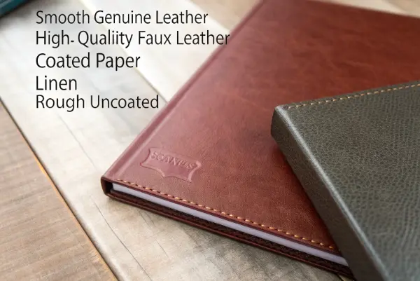
I’ve seen firsthand how a beautiful design can be ruined by the wrong material choice. One time, a client insisted on a very intricate, delicate script font on a coarse linen cover. Despite our warnings and test samples, they went ahead. The final result was disappointing; the foil didn’t settle into the deep weave of the fabric, and the delicate letters looked broken and illegible. This is why we always, always produce a physical sample on the exact material before a full production run. It’s a crucial step to manage expectations and ensure a quality outcome.
Matching Materials and Designs for Flawless Foiling
To avoid problems, you need to think about the material and the design complexity together. A simple, bold design can work on more textures, while intricate designs demand a smooth surface.
-
The Ideal Canvas: Smooth Surfaces
- Genuine & PU Leather: These are the gold standard for foil stamping. Their smooth, consistent surface allows for incredible detail. The heat and pressure of the stamping process create a slight deboss effect, pressing the foil into the material for a durable and high-end finish. This is why premium Bibles are almost always bound in leather or a quality synthetic equivalent.
- Coated Paper/Art Paper: Heavyweight coated papers, often used for paperback or flexible covers, are also excellent for foiling. The coating on the paper provides a smooth, non-porous layer for the foil to adhere to, resulting in sharp lines.
-
The Challenging Textures: Fabrics and Uncoated Papers
- Linen & Fabric Covers: While they offer a lovely tactile feel, fabric covers are tricky. The weave of the fabric creates an uneven surface. For these materials, I advise clients to use bold, simple designs with thick lines. Very small text or complex filigree patterns are likely to fail. We might also need to use a special type of foil or adjust the stamping pressure to get the best possible result.
- Uncoated & Textured Paper: These papers are porous and can have an uneven surface. The foil can sometimes look "spotty" or fail to adhere cleanly. For these materials, debossing first and then applying the foil (a process called foil-debossing) can help by creating a smoother, compressed area for the foil to stick to.
-
A Note on Debossing:
Pairing foil stamping with debossing (pressing a die into the surface to create a depression) can enhance the effect on almost any material. The debossed area provides a clean, recessed bed for the foil, protecting it from wear and tear and adding a satisfying textural depth. This is a premium finish that communicates exceptional quality.
What Design Details Are Critical for Religious Foil Stamping?
You have a vision for a beautiful, intricate design for your cover, but you’re not sure if it’s technically possible. Designs with very fine lines, tiny text, or elements placed too close together can be a production nightmare. If the design isn’t optimized for foil stamping, you risk blurred details and a messy, unprofessional final product.
For successful foil stamping, it’s crucial to use bold, clear designs. Avoid extremely thin lines (less than 0.25 pt), as they may not transfer cleanly. Ensure there is adequate spacing between foiled elements to prevent them from "bleeding" into each other. Small, intricate text should be avoided; stick to clear, legible fonts at a reasonable size. Always convert fonts to outlines and provide vector artwork for the sharpest possible result.
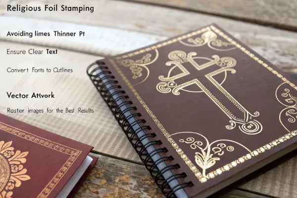
Thinking like a manufacturer is key here. Remember, we are creating a physical metal die from your design and using it to press foil onto a surface with heat. This physical process has limitations that digital design does not. I often work with designers to slightly tweak their artwork for production. A small adjustment, like thickening a line by a fraction of a millimeter or increasing the space between letters, can be the difference between a failed stamp and a perfect one. It’s a collaborative process to ensure the artistic vision is realized beautifully.
From Digital File to Physical Die: A Manufacturer’s Checklist
To ensure your design translates perfectly, I always review the artwork against a specific set of technical criteria. Getting these details right from the start saves time, money, and frustration.
-
Artwork Format: Vector is King
Always, without exception, provide your artwork in a vector format (like an .AI or .EPS file). Vector graphics are made of lines and curves, not pixels. This means we can scale your design to any size without losing quality, resulting in an incredibly sharp metal die. A pixel-based file (like a JPEG or PNG) will result in a die with jagged, fuzzy edges. -
Line Thickness and Spacing
This is the most common issue I see.- Minimum Line Weight: Thin lines are the enemy of foil stamping. They can break during the stamping process or not transfer enough foil to be visible. I recommend a minimum line thickness of 0.3 points, but 0.5 points or more is safer, especially on textured materials.
- "Knockout" Spacing: The space between foiled elements is just as important as the lines themselves. If two foil lines are too close, they can merge or "fill in" during stamping. We need enough non-foil space to define the design clearly.
-
Fonts and Text Size
- Convert to Outlines: Before sending the file, all text must be converted to outlines or paths. This turns the letters into vector shapes, so we don’t need to have the specific font installed. It guarantees the text will look exactly as you designed it.
- Legibility is Key: Very small or highly decorative script fonts can be hard to read when foiled. The reflective nature of the foil can make complex shapes blur together. Choose clear, open fonts and keep the size large enough to be easily legible. I often recommend a simple, elegant serif or sans-serif font for the best results.
Think of it this way: your design needs to be strong enough to be physically stamped into a material. Simplicity, clarity, and boldness are your best friends in the foil stamping process.
Conclusion
In summary, foil stamping is a powerful tool for adding reverence and perceived value to religious publications. By carefully choosing the application points, foil colors, cover materials, and optimizing your design files, you can transform a simple book into a timeless, cherished object. These considerations ensure the final product is not only beautiful but also respectful of the sacred content within.

