Your notebook covers look flat and uninspired, failing to grab a customer’s attention on a crowded shelf. This means your brand gets lost in a sea of similar-looking products, missing the chance to make a memorable first impression. Using custom embossing or debossing gives your covers a tactile, sophisticated dimension that people can see and feel, making your product instantly stand out.
Embossing and debossing are finishing techniques that create a three-dimensional effect on paper or other substrates. Embossing uses a die to raise a design from the surface, while debossing uses a die to press a design into the surface. These methods add a touch of luxury and physical texture to notebook covers, enhancing the perceived value and communicating premium quality. This tactile element invites touch, making a product more engaging and memorable than a standard flat print.
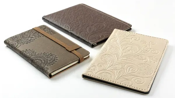
These techniques are more than just a visual flourish; they are a direct communication of quality. When a customer picks up a notebook and feels the raised logo or the indented pattern, it creates an immediate connection. It suggests that care and thought went into every detail of the product. But to achieve that perfect finish, you need to understand the nuances of each process, from the dies used to the materials chosen. In the following sections, we will explore these details to help you make the best choice for your brand.
What’s the Real Difference Between Embossing and Debossing?
You often hear the terms "embossing" and "debossing" used as if they are the same thing. This confusion can lead to simple but costly mistakes in product development, causing miscommunications with your manufacturing partner. Understanding the distinct process and unique effect of each is the first step to choosing the right finish for your brand’s vision.
The main difference lies in the direction of the impression. Embossing creates a raised design that stands up from the cover material. This is done by pressing the material between two custom-made dies. Debossing, on the other hand, creates a recessed design that is indented into the material. This is typically done with a single die stamping the material from above. One pushes out, the other presses in, each offering a distinct tactile experience.
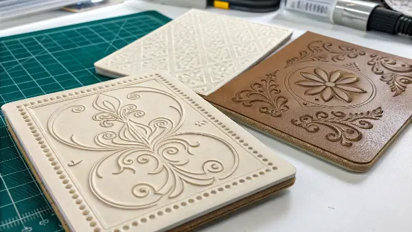
To go deeper, the choice between embossing and debossing really depends on the aesthetic you want to achieve. Embossing feels more pronounced and tends to catch the light in a very dynamic way. It literally makes your logo or design pop. I remember working with a client on a new line of premium journals. They wanted their brand to feel bold and assertive, so we chose to emboss their logo. The final product had a powerful presence on the shelf.
Debossing, in contrast, offers a more subtle, understated elegance. It feels crafted and sophisticated, like an old-world bookbinder’s mark. It’s perfect for brands aiming for a minimalist or classic look. A blind deboss (an impression without any ink or foil) on a textured paper or a PU leather cover is one of my favorite combinations. It’s pure texture and form.
Understanding the Mechanics
At the core, the process determines the outcome. Let’s break down the key differences to make it clearer.
- Embossing: This requires a "male" die (the design) and a "female" counter-die (a reverse image of the design). The paper is placed between them, and pressure is applied. The paper is forced into the counter-die, creating the raised effect. It’s a bit more complex to set up due to the need for two perfectly aligned dies.
- Debossing: This process is simpler. It uses just one "male" die. The die is heated and pressed directly onto the material’s surface, creating the indentation. It’s essentially a high-quality stamping process.
Here is a simple table to summarize the comparison:
| Feature | Embossing | Debossing |
|---|---|---|
| Visual Effect | Raised, 3D design that pops out from the surface. | Indented, recessed design pressed into the surface. |
| Process | Paper is pressed between two matching dies. | A single die is pressed down onto the paper. |
| Tactile Feel | Bumpy, prominent, assertive. | Sunken, subtle, understated. |
| Best For | Making logos and key elements stand out boldly. | Creating subtle patterns or elegant logos. |
How Does the Die-Making Process Impact Final Quality?
You have approved a beautiful, intricate design for your new notebook cover, but the final embossed sample looks soft and lacks definition. A poorly made die can ruin an entire production run, destroying your design’s integrity and wasting valuable time and money. Understanding how a high-quality die is made is the key to ensuring your vision is perfectly realized in the final product.
The die is the custom metal plate, etched with your design, that creates the impression. Its quality directly dictates the sharpness and detail of the final emboss or deboss. Premium dies, typically made of brass, are precision-etched with clean, deep lines. The quality of this etching process, including the angle of the edges and the overall depth, is absolutely critical for achieving a crisp, professional finish that does your design justice.
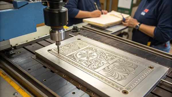
I can’t stress this enough: the project’s success starts with the die. We always insist on seeing the die proofs before a full production run, especially for complex designs. It’s a small step that prevents big problems later. The material of the die, the way your artwork is prepared, and the complexity of the design all play a huge role in the outcome. A small investment in a better die can make a world of difference in the perceived value of your product.
Material Matters: Brass vs. Magnesium Dies
The metal used for your die has a significant impact on cost, durability, and the level of detail it can achieve.
- Brass Dies: These are the gold standard. They are cut using CNC machines, which allows for incredible precision, sharp edges, and fine details. Brass is extremely durable and can withstand high heat and long production runs without losing its edge. For a product line you plan to produce for years, a brass die is a wise investment.
- Magnesium Dies: These are a more cost-effective option. They are created using a chemical etching process, which is faster and cheaper. However, magnesium is a softer metal, so the dies are less durable and may not hold ultra-fine details as well as brass. They are perfectly suitable for short runs or simpler designs.
From Digital File to Physical Die
Artwork preparation is an essential, yet often overlooked, step. Your design must be submitted as a vector file (usually an Adobe Illustrator .ai or .eps file). Vector art is made of lines and curves, not pixels, so it can be scaled to any size without losing quality. This ensures the die-making machine can cut a clean, crisp edge. Details like line thickness and the space between elements are also critical; if lines are too thin or too close together, they can merge or disappear during the embossing process.
Finally, you can choose between different die styles for different effects. A single-level die creates a uniform, flat raised surface. A multi-level or sculpted die has varied depths, creating a more dynamic, truly 3D shape. A sculpted die is a piece of art in itself and is perfect for high-end, premium products where you want to create a stunning tactile centerpiece.
Which Materials Work Best for Embossing and Debossing?
You are excited about adding a tactile finish to your notebook, but you are not sure if your chosen cover material can handle the process. Selecting the wrong material can lead to disappointing results like cracking paper, weak impressions, or even tearing. Knowing which materials perform best ensures you get a durable, beautiful, and impressive finish every time.
Ideally, you want to use thicker, more flexible materials. Uncoated paper stocks with long fibers, such as cotton paper or high-quality art paper, are perfect because they can be reshaped without breaking. Heavy cardstock (we recommend 250gsm or higher) also works very well. For notebooks, materials like PU leather and fabric book cloth are excellent choices as they deboss beautifully, creating a crisp and lasting impression. The choice of material is fundamental to the success of the effect.
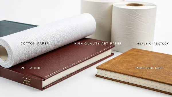
I always advise my clients to think about the material and the decoration method at the same time. They are not separate decisions. A beautiful design can be completely lost on the wrong paper. One time, a client wanted a very deep deboss on a thinner, coated stock. We ran some tests for them, and the results confirmed our fears: the coating started to crack, and the paper was weakened. We switched to a thicker, uncoated kraft paper, and the effect was stunning—rustic, tactile, and durable.
Best Choices for Covers
Let’s look at the best options for achieving a professional finish.
- Paper & Cardstock: Uncoated paper is your best friend here. The fibers are more exposed and flexible, allowing them to be molded into the desired shape. Coated papers have a clay layer on top that can sometimes crack under the pressure of embossing. As a general rule, the heavier the paper (measured in gsm or pounds), the deeper and more noticeable the impression can be.
- PU Leather (Faux Leather): This is one of the most popular materials for journals and planners for a reason. It debosses incredibly well, creating a sharp, clean indentation that gives a very premium and professional feel. It’s also durable and comes in a huge range of colors and textures.
- Book Cloth & Textiles: Fabric-covered notebooks offer a classic, library-style appeal. Book cloth, which is a cloth material backed with paper, responds well to both debossing and foil stamping.
Materials to Use with Caution
Not all materials are created equal. Some are simply not suited for these techniques. You should generally avoid very thin paper (below 120gsm) as it can easily tear. Heavily laminated or varnished stocks can also be problematic, as the finish can bubble or crack around the embossed area. Finally, materials that already have a very heavy, deep texture might not be a good choice, as the embossed or debossed design could get lost in the existing pattern.
| Material Type | Recommended for Embossing/Debossing? | Notes |
|---|---|---|
| Uncoated Paper (>250gsm) | Highly Recommended | Excellent for deep, crisp impressions. The fibers mold beautifully. |
| PU Leather | Highly Recommended | Perfect for debossing. Creates a sharp, elegant, and durable finish. |
| Book Cloth | Recommended | Great for a classic, high-end look. Best with foil and debossing. |
| Coated Paper | Use with Caution | Can crack if the impression is too deep or the stock is not thick enough. |
| Thin Paper (<120gsm) | Not Recommended | Prone to tearing and the effect will be very subtle or lost. |
Can You Combine Embossing with Other Printing Techniques?
A simple blind emboss is elegant, but you’re looking to create something more vibrant and eye-catching. Sticking to a single finishing technique might make your product look too plain, especially when the market is filled with bold, colorful designs. The good news is that you can combine embossing with other finishes to create a stunning, multi-sensory product that truly stands out.
Absolutely. Combining embossing with other printing techniques allows for layered, high-impact designs that appeal to both sight and touch. The most popular combination by far is foil embossing, where metallic foil is applied to the raised area. This creates a shiny, textured effect. You can also use register embossing, which involves precisely raising a pre-printed area, like an inked logo, to give it a 3D feel. These combinations elevate a design from simply tactile to visually dynamic.
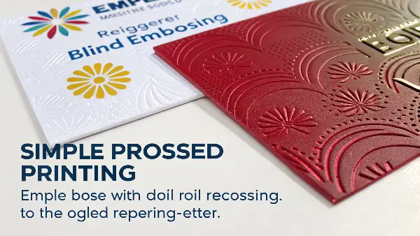
We worked on a project for a lifestyle brand that wanted to create a truly luxurious feel. We ended up combining three techniques on their journal cover: a soft-touch laminate for the background, a debossed pattern for texture, and a register-embossed logo in a contrasting color. The final product felt incredible to hold and looked amazing. It’s this kind of thoughtful combination that turns a simple notebook into a premium gift item. Thinking about how different finishes interact is where you can get really creative.
The Classic: Foil Embossing
This is the technique people most often think of when they imagine a "fancy" book cover. It involves using a heated die to press a thin layer of metallic foil onto the paper. When combined with embossing, the process can often be done in a single step with a specialized die. The result is a design that is both raised and shiny.
- Foil Options: The possibilities are endless. Beyond classic gold, silver, and copper, you can get foils in a huge range of colors, from rose gold to blue to black. There are also holographic foils that shift in the light, and matte foils for a more subtle, modern look.
The Subtle Art: Register Embossing
This technique requires incredible precision. First, an image or text is printed on the material using standard ink. Then, an embossing die is carefully aligned (or "registered") to match the printed area perfectly. The pressure is applied, raising only the printed portion of the design. This adds a tangible dimension to your colored logo or artwork. It’s more subtle than foil but adds a wonderful layer of sophistication.
Other Creative Combinations
The possibilities don’t stop there. Here are a few other ideas to consider:
- Blind Emboss with Spot UV: Create a blind embossed logo, then apply a clear, glossy UV varnish over the top. This creates a stunning contrast between the matte paper texture and the high-gloss raised area.
- Deboss with Color Fill: Deboss a design into the cover, and then fill the indentation with ink. This creates a beautiful letterpress-style effect that is both tactile and visual.
- Pattern Deboss on Full Cover: Instead of just a logo, you can deboss a subtle pattern (like linen or geometric shapes) over the entire cover. This adds a background texture that makes the whole product feel more expensive.
What are the Key Design Considerations for These Techniques?
A design looks perfect on your computer screen, but the physical sample comes back looking like an indistinct mess. Without understanding the physical limitations of embossing and debossing, your detailed artwork can fail to translate, wasting your investment in design and tooling. Designing with the final 3D effect in mind from the very start is crucial for success.
When designing for embossing or debossing, keep it simple and bold. Avoid using extremely fine details, thin lines, or small text, as these elements can get lost or clog up during the impression process. Always ensure there is enough negative space around your design elements so they have room to stand out. Finally, it’s essential to create your artwork in a vector format and to consider the "bruising" effect on the reverse side of the paper.
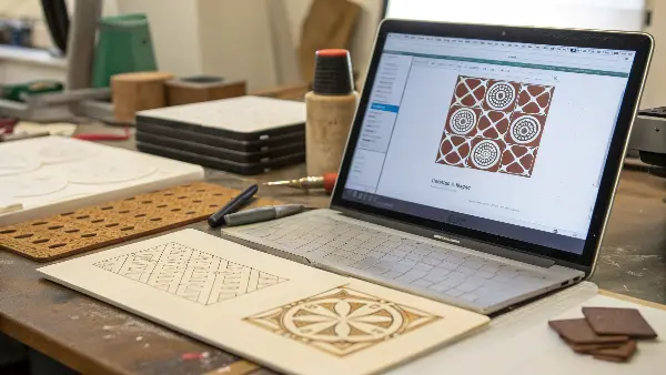
I’ve seen this happen before. A designer creates a beautiful, intricate crest for a brand, filled with tiny lines and delicate text. On screen, it looks amazing. But when you try to turn that into a 1.5-inch brass die, all that detail just merges together. We always work with our clients to simplify their designs for embossing, focusing on the strongest shapes to ensure the final product is clean, crisp, and recognizable.
Artwork and Technical Specs
Getting the design right from a technical standpoint will save you headaches down the line.
- Vector is King: As mentioned before, artwork must be in a vector format (
.ai,.eps,.pdf). This is non-negotiable. A pixel-based file like a.jpgor.pngwill result in a die with fuzzy, jagged edges. - Line Weight Matters: For the best results, lines should be no thinner than 0.5 points. For debossing, you can sometimes go a little finer, but it’s a good rule of thumb. Anything thinner risks not showing up at all.
- Give It Space: The space between design elements is just as important as the lines themselves. If positive elements are too close, the paper between them can get pushed down, making the whole design look muddy.
The "Bruising" on the Back
Remember that when you emboss something (push it up from the back), you are creating a mirrored deboss on the reverse side. This is sometimes called "bruising." You need to account for this in your overall product design. If you are embossing a logo on the front cover of a notebook, this isn’t an issue. But if you are designing a presentation folder or a single-sheet book jacket, you can’t place any important text or images on the back of the embossed area, as they will be distorted.
Here is a quick reference for designing effectively:
| Design Do’s | Design Don’ts |
|---|---|
| DO use bold fonts and strong, simple shapes. | DON’T use overly detailed or complex textures. |
| DO leave generous space around your design. | DON’T use very thin lines or small, delicate fonts. |
| DO create your artwork in a vector format. | DON’T forget about the reverse side of the embossed sheet. |
| DO consider the texture of your chosen material. | DON’T place a large embossed area very close to the paper’s edge. |
Conclusion
Embossing and debossing are powerful tools that do more than just decorate a cover; they add tangible value and tell a story of quality. By understanding the differences between them, choosing the right materials, and designing with the process in mind, you can elevate your products from ordinary to extraordinary, creating a lasting impression that customers can literally feel.

