Publishing religious texts comes with immense responsibility. A single printing error, a weak binding, or pages that yellow can undermine the reverence of the work and damage your readers’ trust. Imagine the distress caused by a smudged verse or a cover that falls apart, turning a cherished object into a source of disappointment and leading to costly recalls.
To guarantee quality, you must implement a rigorous checklist covering every production stage. This starts with specifying durable materials like high-opacity, acid-free paper and robust cover stocks. It requires meticulous pre-press proofing for textual accuracy, color consistency, and layout. Finally, you must inspect the binding, finishing details like gilding or ribbons, and packaging to ensure the final product is flawless, durable, and worthy of its sacred content. A partnership with an experienced manufacturer is essential to manage this process effectively.

Creating a publication that will be treasured for years, or even generations, is a unique challenge. Unlike a standard novel, these books are often used daily, carried everywhere, and passed down as family heirlooms. This means the standards for quality are incredibly high. Every single detail, from the feel of the paper to the strength of the binding, contributes to the reader’s experience and their connection to the text. I’ve worked with many publishers in this space, and I know the care required. It’s not just about manufacturing a book; it’s about crafting an artifact of faith. Let’s break down how to ensure that quality is built in from the very start.
What Material Specifications Are Crucial For Sacred Texts?
Choosing the wrong materials can doom a sacred text from the start. Thin paper allows text to bleed through, disrupting the reading experience. Acidic paper yellows and becomes brittle over time, destroying the book’s longevity. These aren’t just minor flaws; they are fundamental failures that show a lack of respect for the content and the reader.
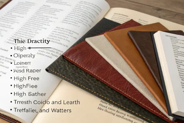
For sacred texts, you must specify materials that ensure durability and reverence. Prioritize thin, high-opacity, acid-free paper to prevent bleed-through and yellowing. For covers, select robust options like genuine leather, high-quality faux leather, or durable linen cloth. Also, insist on high-grade inks for sharp text and strong, flexible adhesives for the binding. These choices are fundamental to creating a lasting, high-quality publication that honors its sacred purpose.

The materials you choose are the foundation of the final product. I remember a client who was developing a new line of daily prayer books. They initially considered a standard paper stock to manage costs. I showed them a 10-year-old book printed on similar paper—it was yellow, brittle, and the ink had faded. Then I showed them a 20-year-old book made with archival-quality paper. It looked almost new. The choice became obvious. For publications meant to last, material selection is not a corner you can afford to cut. It’s an investment in the book’s legacy and your brand’s reputation.
The Foundation: Paper and Ink
The paper is where the reader’s journey begins. It must feel good to the touch and perform perfectly.
- Paper Opacity: Religious books often use very thin paper to keep the volume manageable. High opacity is non-negotiable to prevent text from the other side of the page from showing through. This is known as "ghosting" and it severely impacts readability.
- Acid-Free Properties: Paper containing acid will yellow and degrade over time. For a book intended to be an heirloom, you must use archival-quality, acid-free paper. This ensures it will remain pristine for decades.
- Ink Quality: The ink must be deeply pigmented for crisp, clear text. It should also be smudge-resistant and stable, ensuring it doesn’t fade over the years.
The Protection: Cover Materials
The cover is the book’s first impression and its primary protection.
| Cover Material | Best For | Considerations |
|---|---|---|
| Genuine Leather | Premium, heirloom editions | Higher cost, requires specialized craftsmanship. |
| Faux Leather (PU) | Durable, cost-effective premium alternative | Quality can vary; choose a reputable supplier. |
| Linen/Cloth | Classic, elegant, and tactile feel | Can be prone to staining if not treated. |
| Heavy Cardstock | Softcover editions, journals, workbooks | Less durable for long-term daily use. |
Choosing the right cover depends on the book’s intended use and price point. A premium Bible might warrant genuine leather, while a weekly study guide may be perfect with a beautifully designed cardstock cover.
How Do You Ensure Printing and Textual Accuracy?
Imagine discovering a typo in a key passage or finding that entire pages are printed too lightly to read. For a religious text, such an error is more than an inconvenience; it can be seen as a deep sign of disrespect. The fallout can be devastating, leading to angry customers, public criticism, and the enormous expense of reprinting an entire run.
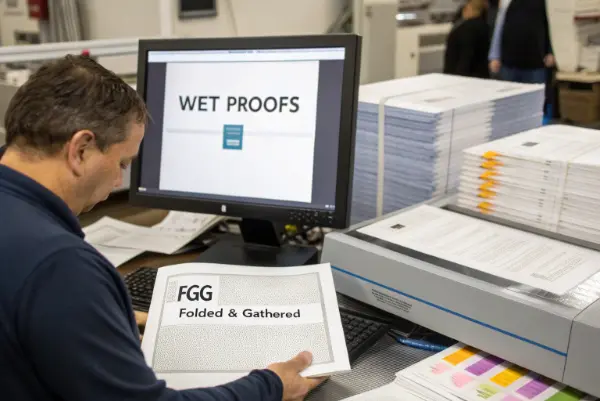
To ensure accuracy, you must implement a multi-stage proofing process. This involves a final digital proof review, followed by physical "wet proofs" or F&G (Folded & Gathered) proofs from the manufacturer before the full production run. These physical copies allow you to check for textual integrity, color accuracy, print alignment, and paper quality in person, catching potential errors before they are multiplied by the thousand.

Mistakes in printing are a publisher’s worst nightmare, and I’ve seen how easily they can happen without strict controls. A few years ago, we worked with a publisher on a bilingual Bible. A small file error caused the text columns to become misaligned on a few pages. Luckily, we caught it during the F&G proofing stage. The client was able to review a full, unbound copy of the book exactly as it would be printed. We corrected the file, and disaster was averted. This experience cemented my belief that you can never be too careful. Trusting that the digital file is perfect is not enough; you must see and touch a physical proof.
The Pre-Press Checklist
Before a single page is printed, your team and the manufacturer’s team must be perfectly aligned.
- Final Digital Proof: Your last chance to catch typos, grammatical errors, or formatting issues. Everyone on your editorial team should sign off on this master file.
- Imposition Proof: The manufacturer will show you how the pages are laid out on the large printing sheets. This is a technical check to ensure pages are in the correct order and orientation after being folded and cut. Don’t skip this step.
The On-Press Inspection
Physical proofs are where you catch what digital files can’t show you.
- Color Matching: If your publication includes color illustrations or headings, a press check is vital. You need to ensure the colors match your intended vision, as they can look very different on screen versus on paper.
- Ink Density and Registration: Check for consistency. Is the black text truly black across all pages? Are there any pages that look faded or smudged? Is all the text properly aligned without any ghosting or shadows?
A structured proofing process removes guesswork and prevents costly errors.
| Proof Stage | Purpose | Who is Responsible? |
|---|---|---|
| Digital Proof | Final check for content, grammar, and layout. | Publisher’s Editorial Team |
| Imposition Proof | Technical check of page arrangement for printing. | Manufacturer & Publisher Review |
| Wet/F&G Proof | Physical check of paper, ink, color, and final feel. | Publisher’s Production Manager |
| First-Off-Press | Final sample from the main production run for final approval. | Manufacturer QC & Publisher |
This layered approach is your best insurance policy against printing errors.
Which Binding and Finishing Details Demand the Most Attention?
You’ve sourced the best paper and ensured the printing is perfect. But the book falls apart after a few months of use. The beautiful gold foil on the cover starts flaking off. A weak or poorly executed binding completely undermines all the other quality work you’ve done, leaving customers with a product that feels cheap and disposable.
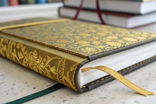
Pay closest attention to the binding method and finishing touches. For durability, a Smyth-sewn binding is the gold standard, as it allows the book to lay flat and holds pages securely. For finishing, inspect foil stamping for clean edges and strong adhesion. Check that decorative gilding is even and that any marker ribbons are securely attached and cut cleanly. These details signal quality and craftsmanship to the reader.

The binding and finishing are what elevate a book from a simple collection of pages into a durable, beautiful object. I once had a client who was launching a premium journal. They were very focused on the cover design but hadn’t specified the binding method. The initial samples they received used a standard "perfect binding" (glued spine). The journal didn’t lay flat, making it difficult to write in. We suggested switching to a Smyth-sewn binding. The added cost was minimal, but the improvement in user experience was huge. It transformed the product from frustrating to use into a joy to write in.
The Strength of the Spine: Binding
The binding holds everything together, and its quality determines the book’s lifespan.
- Smyth-Sewn Binding: This is the highest quality method. Pages are physically stitched together in signatures, which are then bound into the book. It is incredibly strong and allows the book to lay completely flat, making it ideal for Bibles and prayer books.
- Case Binding: This is the standard for hardcover books. The interior block of pages (which can be Smyth-sewn or glued) is attached to a rigid outer cover. The strength depends on the quality of the glue and the "endpapers" that hold it all together.
- Perfect Binding: Pages are glued together at the spine. This is common for softcover books and is less durable than sewing. It’s acceptable for workbooks or short-term use publications, but not for heirloom-quality texts.
The Final Flourish: Finishing Details
These small touches have a big impact on perceived value.
| Finishing Detail | What to Inspect | Common Failure Point |
|---|---|---|
| Foil Stamping | Clean edges, no bleeding or flaking. Full, consistent coverage. | Foil not adhering properly due to incorrect heat/pressure. |
| Edge Gilding | Smooth, even application of gold or silver leaf on page edges. | Uneven color, flaking, or a gritty texture. |
| Ribbon Markers | Securely attached within the binding, cleanly cut or heat-sealed. | Ribbons fraying or pulling out easily. |
| Debossing/Embossing | Crisp, clear impressions with consistent depth across the design. | A weak or shallow impression that lacks impact. |
These details are often the first thing a customer notices. Getting them right shows an unwavering commitment to quality.
Conclusion
A rigorous quality control checklist is not a bureaucratic hurdle; it is an essential act of stewardship. By meticulously managing materials, proofing, and finishing, you honor the sacred text and the reader’s faith. This commitment ensures you produce a publication that is not only beautiful and durable but also a worthy vessel for its timeless message.

