Are you trying to create a religious book cover that feels truly special and reverent? It’s tough when standard printing methods leave the final product looking flat and lacking the premium, tactile quality you envision. You need a cover that not only looks beautiful but also feels significant in the hands of the reader, conveying a sense of timeless value and spiritual importance.
Embossing and debossing are finishing techniques that create a three-dimensional effect on book covers. Embossing produces a raised design, while debossing creates an indented impression. These methods use custom metal dies and pressure to add a sophisticated, tactile quality. This enhances the perceived value and spiritual connection of religious texts, making them stand out as cherished keepsakes rather than just books. The result is a cover that invites touch and communicates reverence through its very construction.
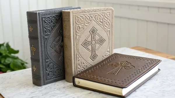
I’ve worked with many clients like you, Michael, who are looking for that extra touch of elegance. You understand that for a religious book, the cover is more than just protection; it’s the first point of physical connection to the sacred text inside. The feel of the book can be just as important as its appearance. But bringing that vision to life requires understanding the technical details. Let’s dive into what makes these techniques work and how you can use them to create something truly memorable.
What Is the Process of Embossing and Debossing?
You know these techniques add a premium touch, but you’re not entirely sure how they work. This uncertainty can make it difficult to specify your exact needs to a supplier or anticipate potential design challenges. Without a clear understanding of the process, you might face communication gaps, unexpected costs, or a final product that doesn’t quite match your vision.
The process for both techniques starts with creating a custom metal die of your design. For embossing, the cover material is pressed between this die and a counter-die, which forces the design upward to create a raised effect. For debossing, a single die is used to press the design down into the material, creating an indented impression. Both methods require precise machinery that applies controlled heat and pressure to ensure a crisp, permanent result without damaging the material.
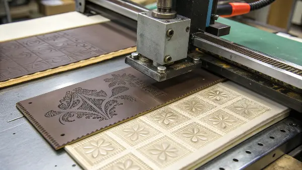
Understanding the mechanics of these processes is key to making informed decisions for your product line. When I first started working with these finishes, I was fascinated by the blend of artistry and engineering involved. It’s not just about pressing a design into paper; it’s a carefully calibrated operation. Let’s break it down further so you can approach your next project with total confidence.
Creating the Dies
The quality of the final impression starts with the die. For any design, a custom die must be CNC-milled from a block of metal, usually brass or magnesium. Brass is more expensive but incredibly durable, making it perfect for large, repeatable runs where consistency is paramount. For debossing, you only need one die. For embossing, however, you need two: a "female" die (the indented design) and a "male" counter-die that fits perfectly into it. This pair is what allows the material to be pushed up from behind, creating the raised effect. The precision required here is immense—even a tiny misalignment can ruin the impression.
The Machine in Action
Once the dies are ready, they are mounted onto a press. The cover material—whether it’s heavy cardstock, leatherette, or genuine leather—is then fed into the machine. Here’s a simplified breakdown of what happens next:
| Step | Embossing Process | Debossing Process |
|---|---|---|
| 1. Setup | Mount female die and male counter-die on the press. | Mount single female die on the press. |
| 2. Heating | The dies are heated to a specific temperature. | The die is heated (optional but recommended). |
| 3. Placement | The book cover material is placed between the dies. | The book cover material is placed under the die. |
| 4. Impression | The press closes, squeezing the material between dies. | The press applies downward pressure on the material. |
| 5. Result | A raised, three-dimensional design is formed. | An indented, three-dimensional design is formed. |
Heat softens the fibers of the material, allowing for a deeper and more permanent impression. Pressure ensures the design is crisp and well-defined. The balance between heat, pressure, and "dwell time" (how long the pressure is applied) is a science that our best machine operators have perfected over years.
The Materials Matter
Not all materials react the same way. Thicker, more fibrous materials like uncoated paper stock, PU leather, and certain fabrics are ideal because they hold the shape well. Thinner or heavily coated materials can crack or tear under pressure. For religious books, materials that emulate classic, durable bindings work exceptionally well with both embossing and debossing.
How Do You Actually Emboss a Book Cover?
You’ve decided on an embossed finish for its raised, premium feel, but how do you get from a digital design to a physically embossed cover? The details are crucial. Choosing an overly intricate design or the wrong material can lead to cracking, a blurry impression, or other imperfections. This can derail your production timeline and add unnecessary costs.
To emboss a book cover, you start with a vector file of your artwork, which is used to mill a female die and a male counter-die. Your chosen cover material is then carefully positioned between these two dies inside a press. The machine applies calibrated heat and immense pressure, forcing the material into the die’s recess to create the permanent raised design. The success of the emboss depends heavily on the precise calibration of heat, pressure, and how long the pressure is held.
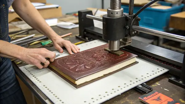
It’s one thing to understand the theory, but seeing it applied specifically to a book cover helps clarify the practical steps. I remember working on a project for a client who wanted an extremely detailed family crest embossed on a leather-like cover. We had to go back to the drawing board to simplify the artwork slightly, thickening some lines to ensure the final product was sharp and clear. These are the kinds of practical considerations that make all the difference.
From Digital Design to Physical Die
The journey begins with your design file. It must be a vector format (like an .AI or .EPS file). Why vector? Because vectors are scalable without losing quality, and the milling machine needs clean, mathematical lines to create a precise die. Here are a few design tips I always share with clients:
- Avoid Very Fine Lines: Lines that are too thin may not emboss clearly or can even disappear. As a rule of thumb, ensure all lines are at least 0.5 points thick.
- Allow for Breathing Room: Elements placed too close together can look muddled when raised. Ample negative space helps the embossed design pop.
- Consider the Material: A softer, thicker material can handle more intricate details than a stiffer, thinner one.
Types of Embossing for Added Effect
Beyond a simple raised design, you have a few options to enhance the look even further. Each offers a different aesthetic that can be tailored to the tone of a religious text.
| Type of Embossing | Description | Best For |
|---|---|---|
| Blind Emboss | The classic technique with no ink or foil. Creates a subtle, elegant effect. | Minimalist, sophisticated designs. Great for symbolic icons or titles on high-quality materials. |
| Foil Emboss | Combines foil stamping with embossing in a single pass. | Adding a touch of divine light or importance. Gold or silver foil on a cross or title is a classic. |
| Multi-Level Emboss | Uses a special die to create multiple levels of height in the design. | Creating a truly sculptural, high-impact effect. Best for a central, symbolic image. |
A blind emboss offers quiet reverence, making it a popular choice for Bibles and prayer books. On the other hand, a gold foil emboss can make a book feel like a treasured artifact. Choosing the right type depends entirely on the message and market you want to reach.
Can You Deboss a Book Cover?
While embossing creates a raised design, you might wonder about the opposite effect. Is it possible to create an indented design on a book cover? You might be looking for a more understated, subtle effect that still adds texture and a sense of quality craftsmanship, but you’re unsure if it’s a standard or feasible option.
Yes, you can absolutely deboss a book cover. Debossing is a widely used finishing technique where a heated metal die is pressed into the surface of the cover material, creating a depressed or indented impression. This method is often favored for its subtle, sophisticated look and is particularly effective on textured materials like leather, faux leather, and thick, uncoated paper stocks. It produces a clean, sharp look that suggests classic craftsmanship and timeless quality.
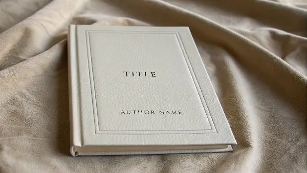
Debossing is one of my favorite techniques, especially for professional or classic-style stationery. It has a certain gravitas to it. Think of old, leather-bound library books with their titles pressed into the spine—that’s the classic appeal of debossing. Unlike embossing, which raises the surface toward the viewer, debossing carves the design into the material, inviting you to trace the lines with your finger. It doesn’t shout for attention; it rewards it.
Why Choose Debossing?
Debossing offers a different kind of tactile experience. It feels grounded and permanent, as if the design is an integral part of the material itself. Here are a few reasons why you might choose it for a religious book cover:
- Subtlety and Elegance: Debossing is less loud than embossing. It provides a touch of class without overwhelming the cover design. For religious texts that emphasize humility and introspection, this understated effect can be very powerful.
- Durability: Because the design is pressed into the material, it is extremely durable and won’t scuff or wear down easily. On a book that is meant to be used daily, like a prayer book or hymnal, this is a significant advantage.
- Excellent for Textured Materials: Debossing works beautifully on materials like PU leather or linen cloth covers. The contrast between the material’s natural texture and the smooth, pressed-in design creates a visually and tactilely appealing effect. I once worked on a line of journals with a linen finish, and the simple, debossed logo in the corner felt incredibly premium.
Combining Debossing with Other Finishes
Just like embossing, debossing can be done on its own (a "blind deboss") or combined with other effects for greater impact.
- Foil Debossing: This is where a layer of foil is placed between the die and the material. The heat and pressure from the die not only press the design in but also transfer the foil. A gold or copper foil debossed into a dark leatherette cover creates a stunning, high-contrast look that feels both luxurious and sacred.
- Ink Debossing (or Color-Fill Debossing): After the design is debossed, it can be filled with ink. This helps the design stand out more than a blind deboss while still retaining that indented feel. It’s less common for high-end books but can be effective for creating a specific color palette.
Ultimately, debossing is a versatile and powerful tool for adding a sense of heritage and quality to a book cover.
Is Embossing or Debossing Better?
You understand the "how" and "what" of both techniques, but now you face the big question: which one is better for your project? Choosing between embossing and debossing can be paralyzing. You want to make the right call to reflect the book’s tone and appeal to your target audience, but both options seem to offer premium benefits.
Neither embossing nor debossing is inherently better; the best choice depends entirely on your design goals, material, and the message you want to convey. Embossing creates a raised design that catches the light and stands out visually, suggesting prominence and celebration. Debossing creates a subtle, indented design that feels classic and understated, suggesting permanence and introspection. The decision should align with the overall aesthetic and tactile experience you want for the end-user.
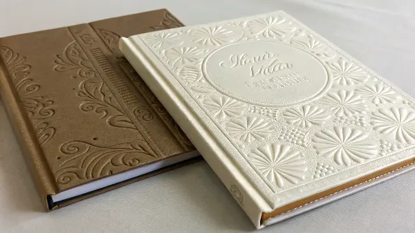
I’ve guided countless clients through this exact decision. There’s no single right answer, but there is a ‘right’ choice for each specific project. Think of it like choosing a font: a bold, decorative font serves a different purpose than a classic, serif font. Similarly, embossing and debossing communicate different feelings. Let’s weigh the key factors to help you decide.
Key Considerations for Your Choice
Think about how you want the customer to feel when they see and hold the book. That feeling should guide your decision. Here are the primary factors to consider when choosing between the two:
1. Desired Aesthetic and Tone
- Embossing (Raised): This technique makes elements literally "pop" off the page. It’s eye-catching, celebratory, and adds a sense of importance and luxury. If you want a title or symbol to immediately draw attention, embossing is a fantastic choice. It feels modern and impressive.
- Debossing (Indented): This method is more subtle and classic. It creates a handcrafted, artisanal feel. If the tone of your book is contemplative, traditional, or minimalist, debossing provides an elegance that is discovered rather than announced. It feels timeless and grounded.
2. Cover Material
- Embossing works best on flexible yet sturdy materials like heavy paper stock or thinner leatherettes. Because the material is being stretched, it needs to have some give to avoid cracking.
- Debossing is incredibly versatile and works well on a wider range of materials, including thick, rigid boards, genuine leather, and heavily textured fabrics. The compressive force of debossing is less likely to damage the material’s surface.
3. Design Complexity
- Embossing: Very intricate designs with fine details can sometimes lose clarity with embossing, as the material has to stretch and fill small spaces. Multi-level embossing can help, but simplicity often yields the best results.
- Debossing: This technique often handles fine detail a bit better, as the die is simply pressing a sharp impression into the surface. The crisp edges of a debossed design can render complex patterns with high fidelity.
Here is a quick summary table I use with my clients:
| Feature | Embossing (Raised) | Debossing (Indented) |
|---|---|---|
| Visual Impact | High, eye-catching, prominent | Subtle, understated, classic |
| Tactile Feel | Bumpy, raised texture | Smooth, indented, carved |
| Best For | Celebratory themes, modern luxury, focal points | Traditional themes, quiet elegance, heritage feel |
| Material Suitability | Flexible papers, some PU leathers | Wide range: leather, thick board, textured fabrics |
| Durability | Good, but raised areas can scuff over time | Excellent, as the design is protected within the surface |
For a commemorative edition of the Psalms, you might choose a gold foil emboss to convey celebration. For a personal prayer journal, a simple blind deboss on a soft-touch cover might feel more appropriate and intimate.
Conclusion
Embossing and debossing are more than just finishes; they are storytelling tools. They transform a standard book cover into a tactile experience, conveying reverence, quality, and timelessness before a single page is turned. By understanding the process and choosing the right technique for your vision, you can create a religious book that truly resonates with its reader.

