Does your book cover blend into the background on a crowded shelf? It’s frustrating when a great publication goes unnoticed because its exterior looks plain and uninspired. Special finishes and embellishments are the solution, transforming your book from a simple product into a premium, tactile experience that demands attention and feels valuable in a customer’s hands.
The right embellishments can dramatically elevate your publication by adding visual and tactile appeal. Finishes like foil stamping, embossing, and Spot UV create a perception of higher value, making your book stand out to customers. They reinforce your brand’s commitment to quality and design, turning a simple object into a memorable experience that encourages purchase and builds loyalty. These techniques are key to creating a product that looks and feels premium.
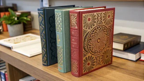
Choosing the right finish for your book or notebook is a crucial step. It’s not just about making it look pretty. It’s about communicating a message about your brand and the product’s quality before someone even reads a single page. I’ve spent years helping clients navigate these choices, and I know that the right combination of finishes can be the deciding factor for a customer. Let’s look at some of the most effective options available and figure out which ones are right for you.
What Makes Foil Stamping a Classic Choice for Luxury?
You want to add a touch of elegance with a metallic shine, but printed metallic inks can often look dull and flat. This can make your carefully designed, high-end product feel cheap and underwhelming. Foil stamping provides a solution by applying a true metallic layer that offers a brilliant, reflective finish that printed ink simply cannot replicate.
Foil stamping is a printing process that uses heat, pressure, and a metallic or pigmented foil to create a shimmering, eye-catching design on paper. It’s a classic choice for luxury because it adds a tangible sense of quality and sophistication. This technique is perfect for highlighting key elements like a title, logo, or intricate pattern, instantly signaling to the customer that this is a premium product worth their attention.
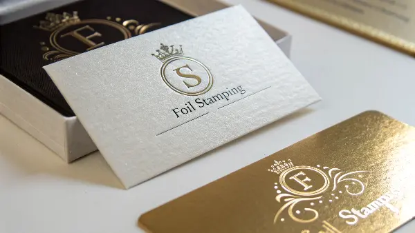
Foil stamping, also known as hot stamping, is a go-to for a reason. It has a timeless appeal that communicates value instantly. The process itself is quite methodical. First, a custom metal die is engraved with your desired design. This die is then heated and pressed onto a roll of foil, which transfers the metallic layer onto the paper stock. This physical impression leaves a slight deboss, adding a subtle textural element that enhances the premium feel. I remember working with a European lifestyle brand on their yearly planners. They wanted something that felt both modern and classic. We decided on a simple, clean design using rose gold foil on a navy blue, soft-touch cover. The contrast was stunning. The way the foil caught the light made the planners fly off the shelves. It was a simple choice, but it perfectly captured the brand’s elegant identity. It’s not just about aesthetics; it’s a smart manufacturing choice that delivers incredible results.
Exploring Your Foil Options
The beauty of foil stamping is its versatility. You are not limited to just gold and silver. There are a variety of foil types, each offering a different look.
| Foil Type | Description & Best Use |
|---|---|
| Metallic Foils | The most common type. Includes gold, silver, copper, rose gold, and other colors. They have a brilliant, metal-like sheen. Best for creating a classic, luxurious, or high-tech look. |
| Pigment Foils | Offer a non-metallic, glossy or matte finish in a wide range of solid colors. Great for creating bold, opaque graphics on dark paper where ink would not be as vibrant. |
| Holographic Foils | Contain a pattern that refracts light to create a rainbow-like, multi-colored effect. Perfect for grabbing attention and adding a futuristic or celebratory feel. |
| Pearlescent Foils | Provide a subtle, pearl-like shimmer. They add a touch of elegance and softness without the high shine of metallic foils. Ideal for wedding stationery or high-end packaging. |
Choosing the right foil depends entirely on your brand’s message and the design itself. For the best results, use foil on smoother, coated paper stocks, as textured paper can cause the foil to break up. It’s perfect for logos, titles, and small decorative elements.
How Do Embossing and Debossing Add a Tactile Dimension?
Your book cover might look great, but it feels flat and uninteresting to the touch. In a world where sensory experience matters, a lack of texture can make your product feel generic and forgettable. Embossing and debossing are powerful tools that solve this problem by creating a three-dimensional effect you can actually feel, inviting customers to engage with the product physically.
Embossing and debossing add a tactile dimension by physically altering the paper’s surface. Embossing raises your design, pushing it up from the surface, while debossing impresses it down into the paper. Both techniques create depth and shadow, transforming a flat cover into a touchable piece of art. This physical engagement makes the product feel more substantial and luxurious, significantly enhancing its perceived quality.
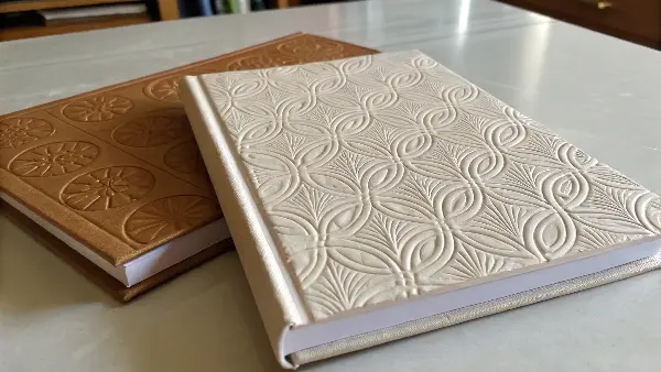
The power of touch in product marketing should never be underestimated. When a customer picks up a notebook and feels a raised logo or an indented pattern, it creates an immediate connection. This tactile experience makes the product feel more carefully crafted and valuable. The process for creating this effect is fascinating. Embossing requires two metal dies: a "male" die that pushes the paper up and a "female" die that the paper is pressed into. Debossing is simpler, using a single die to press the design into the paper. A client of ours, a minimalist stationery brand, wanted a very subtle and elegant look for their journals. We decided on a "blind" deboss, which means we pressed their logo into the cover without using any ink or foil. It created a clean, sophisticated, and understated look that was all about texture. Customers loved it because it felt personal and high-quality, perfectly matching the brand’s ethos.
Choosing Between Embossing and Debossing
While similar, embossing and debossing have distinct characteristics and are suited for different applications. Understanding their differences will help you make the best choice for your project.
| Feature | Embossing (Raised) | Debossing (Indented) |
|---|---|---|
| Visual Effect | Pops out from the surface, creating highlights and shadows. Very eye-catching. | Sinks into the surface, creating a subtle, sophisticated recess. |
| Best For | Logos, titles, and prominent graphics that need to stand out. Works well on thicker paper. | Lettering, monograms, and detailed patterns. Gives a classic, letterpress feel. |
| Combination | Can be combined with foil stamping or ink ("registered emboss") for a dramatic effect. | Often used as a "blind" effect (no ink or foil) for a minimalist, elegant look. |
| Considerations | The back of the page will show a reversed impression. This needs to be considered in the design. | The back of the page is generally not affected, making it a safer choice for single sheets or covers. |
Both techniques work best on thicker, more fibrous paper stock that can hold the shape without tearing or cracking. Heavy cardstock or cover stock is ideal. The key is to use bold shapes and text, as very fine, delicate lines may not translate well. This tactile element is not just a finish; it’s an invitation for the customer to interact with your brand.
When Should You Use Spot UV to Make Your Design Pop?
You want to make specific parts of your cover design shine, but applying a gloss finish to the entire surface can be overwhelming and look generic. This all-or-nothing approach can cheapen the design and hide the subtle details. Spot UV offers a perfect middle ground, allowing you to highlight specific elements with a high-gloss finish for maximum impact.
You should use Spot UV when you want to create a striking contrast between matte and gloss finishes on a single surface. It is a clear, shiny coating applied to specific areas of your design, such as a logo, a photograph, or a text element. This technique draws the eye to key information and adds a modern, sophisticated texture, making a design "pop" against a matte background.
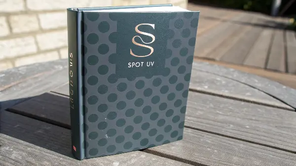
Spot UV is one of my favorite modern finishing techniques because of the dramatic effect it can create with such subtlety. It’s a liquid coating that is applied to the paper and then cured or hardened with ultraviolet (UV) light. The magic of Spot UV is in the contrast it creates. For the best results, you should always apply it on top of a matte laminated surface. The juxtaposition of the super glossy UV areas against the dull, non-reflective matte background creates a visual and tactile experience that is truly impressive. I recall a project for a tech company’s marketing brochure. The cover was a solid, deep black with a matte lamination. We printed their sharp, geometric logo using only Spot UV—no color ink at all. You could only see the logo when the light caught it, making it feel sleek, mysterious, and very high-tech. It was an incredibly effective way to communicate their brand identity without being loud.
Understanding Varnishes and Coatings
Spot UV is a type of varnish, but there are other options available that can protect and enhance your printed product. Understanding the different types can help you specify exactly what you need.
| Varnish Type | Finish & Characteristics | Best Use |
|---|---|---|
| Spot UV | High gloss, slightly raised texture. Cured with UV light. Applied to specific areas. | Creating contrast on matte surfaces, highlighting logos, photos, or patterns. |
| Flood Varnish | A varnish that covers the entire printed sheet ("floods" the page). Can be gloss, matte, or satin. | General protection against fingerprints and scuffs. Gloss can enrich colors, while matte reduces glare. |
| Soft-Touch / Velvet | A type of matte lamination that provides a velvety, rubbery, or suede-like texture. | Creating a luxurious, high-end tactile experience. Excellent for premium product packaging or book covers. |
| Glitter Varnish | A clear varnish filled with small glitter particles. Adds sparkle and texture. | Greeting cards, children’s books, or promotional materials where you want a fun, eye-catching effect. |
For a successful Spot UV application, your design files need to be set up correctly. You’ll need to provide a separate "mask" file that shows exactly where the UV coating should be applied. It’s also wise to avoid using it on very small text or thin lines, as registration can be tricky. When used thoughtfully, Spot UV is a powerful tool to guide the customer’s eye and add a layer of interactive discovery to your design.
How Can Lamination and Die-Cutting Add Durability and Intrigue?
Your publication needs to withstand handling, but you also want it to have a unique and memorable physical form. A standard paper cover can easily get scuffed, torn, or damaged by moisture, while a simple rectangular shape struggles to stand out. Lamination and die-cutting work together to solve both problems, offering protection while creating exciting, custom shapes.
Lamination adds a protective plastic layer that dramatically increases durability and provides a distinct finish (like matte or gloss), while die-cutting uses a custom blade to cut unique shapes or windows into a cover. By combining these two processes, you can create a final product that is not only tough and long-lasting but also visually intriguing and interactive, immediately setting it apart from competitors.
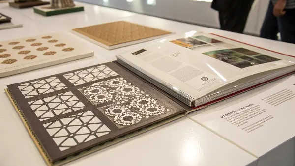
Thinking about a cover’s function is just as important as its form. Lamination is the first line of defense. It’s a thin film that is bonded to the paper, making it resistant to spills, scuffs, and fingerprints. This is essential for products that will be handled frequently, like notebooks, planners, or menus. But lamination also enhances the look. A gloss lamination makes colors pop, while a matte lamination gives a sophisticated, glare-free finish. My personal favorite is the soft-touch lamination; it has a velvety feel that people can’t resist touching. We once produced a series of children’s books for a publisher who wanted a "peek-a-boo" effect. We used a sturdy, matte-laminated cover for durability and then die-cut a circular window in the front. Through the window, you could see a character’s face printed on the very first page. It turned the book into a toy, making it instantly engaging for kids and a clear winner for parents.
A Closer Look at Your Options
Both lamination and die-cutting offer several choices that can be tailored to your specific project needs and budget.
1. Lamination Types: This is about protection and feel.
| Lamination Type | Feel & Appearance | Key Benefit |
|---|---|---|
| Gloss | Shiny, smooth, reflective surface. | Makes colors appear more vibrant and rich. Easy to wipe clean. |
| Matte | Smooth, non-reflective, elegant surface. | Reduces glare and hides fingerprints. Gives a sophisticated, modern look. |
| Soft-Touch | Velvety, suede-like, rubbery texture. | Provides a unique and luxurious tactile experience that encourages touch. |
| Anti-Scuff | A highly durable matte finish. | Offers superior resistance to scratches and scuffs, ideal for dark covers or high-use items. |
2. Die-Cutting Applications: This is about shape and interaction. It involves creating a custom steel rule die, which is a one-time cost for the tool. This die is then used to cut precise shapes. You can create rounded corners, custom-shaped books (like a book shaped like a coffee cup), or intricate windows and patterns on the cover. When designing for die-cutting, it’s important to avoid overly complex shapes that could compromise the cover’s strength and ensure the cuts are not too close to the edge. By combining a protective lamination with a creative die-cut, you create a product that is built to last and designed to delight.
Conclusion
Choosing the right embellishments isn’t just about decoration. It’s a strategic decision that communicates your brand’s quality, captures customer attention, and makes your publication feel special. By thoughtfully combining finishes like foil, embossing, Spot UV, and die-cutting, you can transform a simple book or notebook into a treasured and memorable product experience.

